Canton Controllers
Spring 2022
The Canton Controllers are a fictional esports team that values diversity and equality. The team provides opportunities for less-represented groups in esports while remaining unique and empowering.
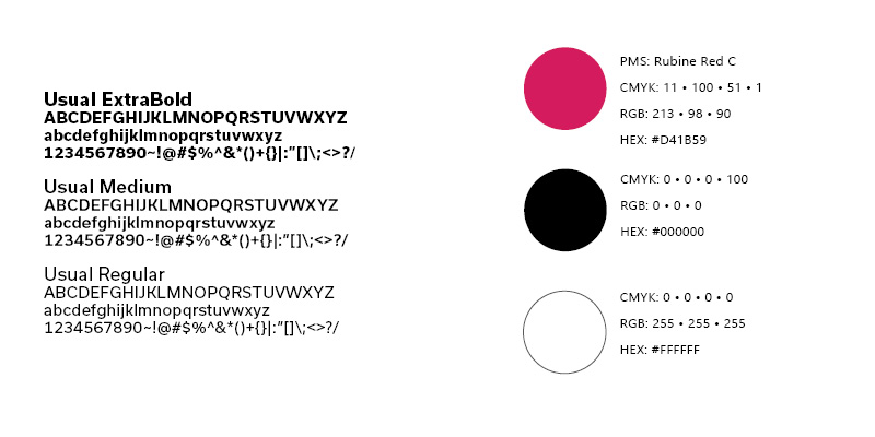
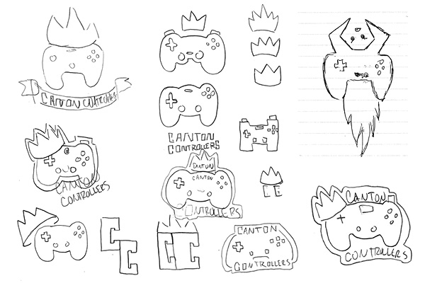
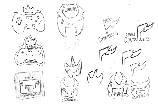
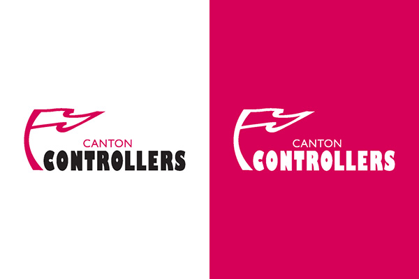
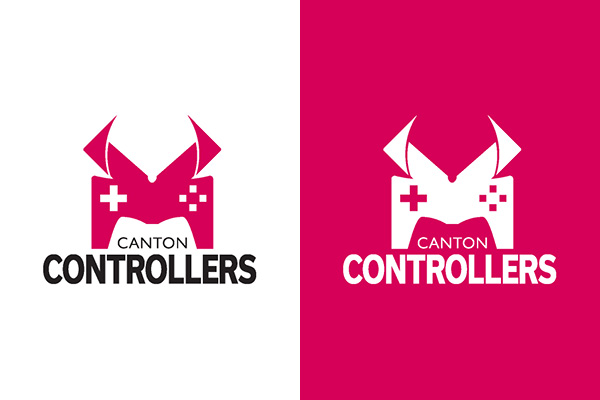
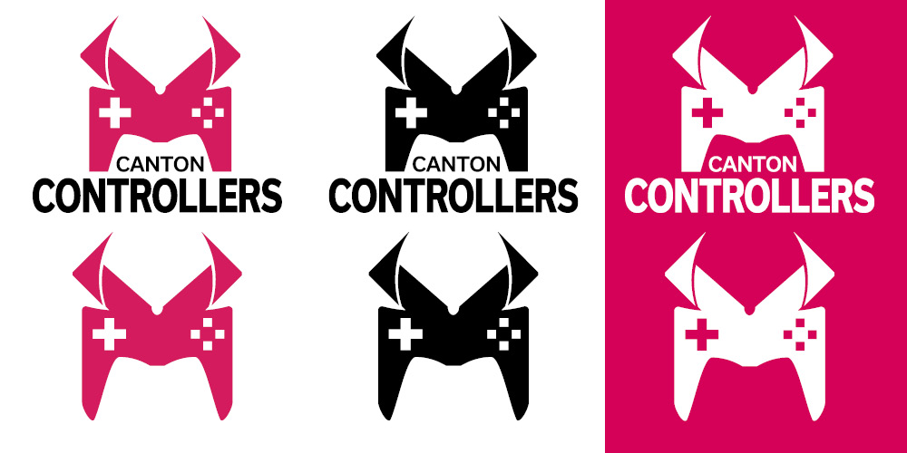
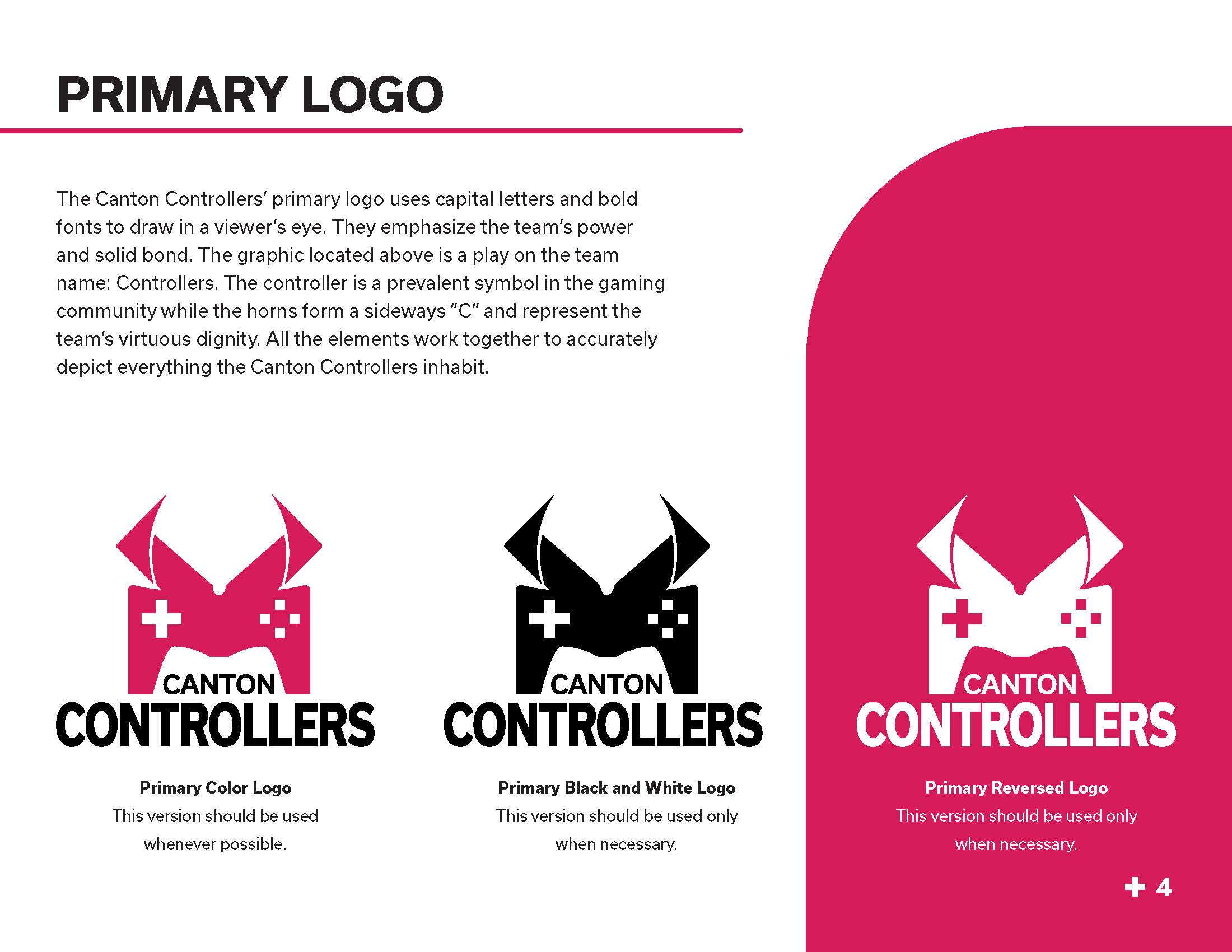
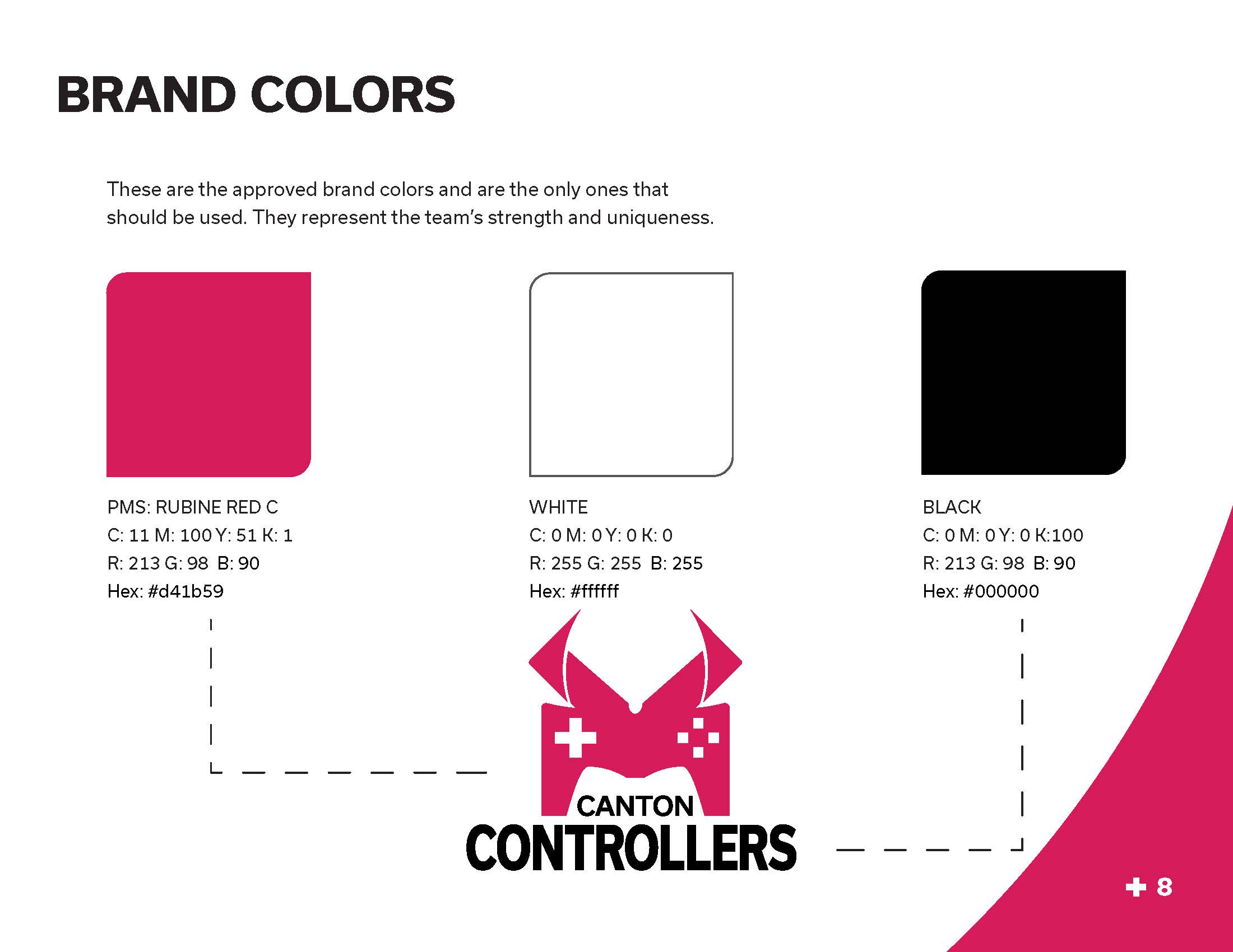
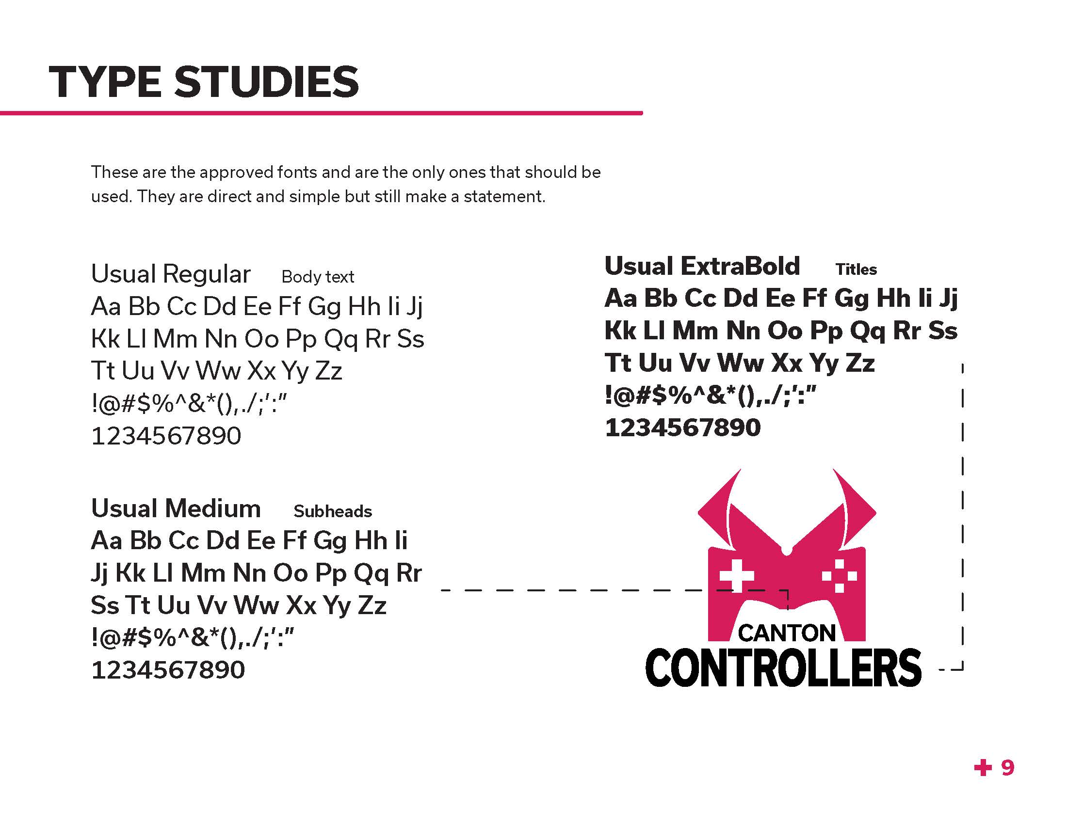
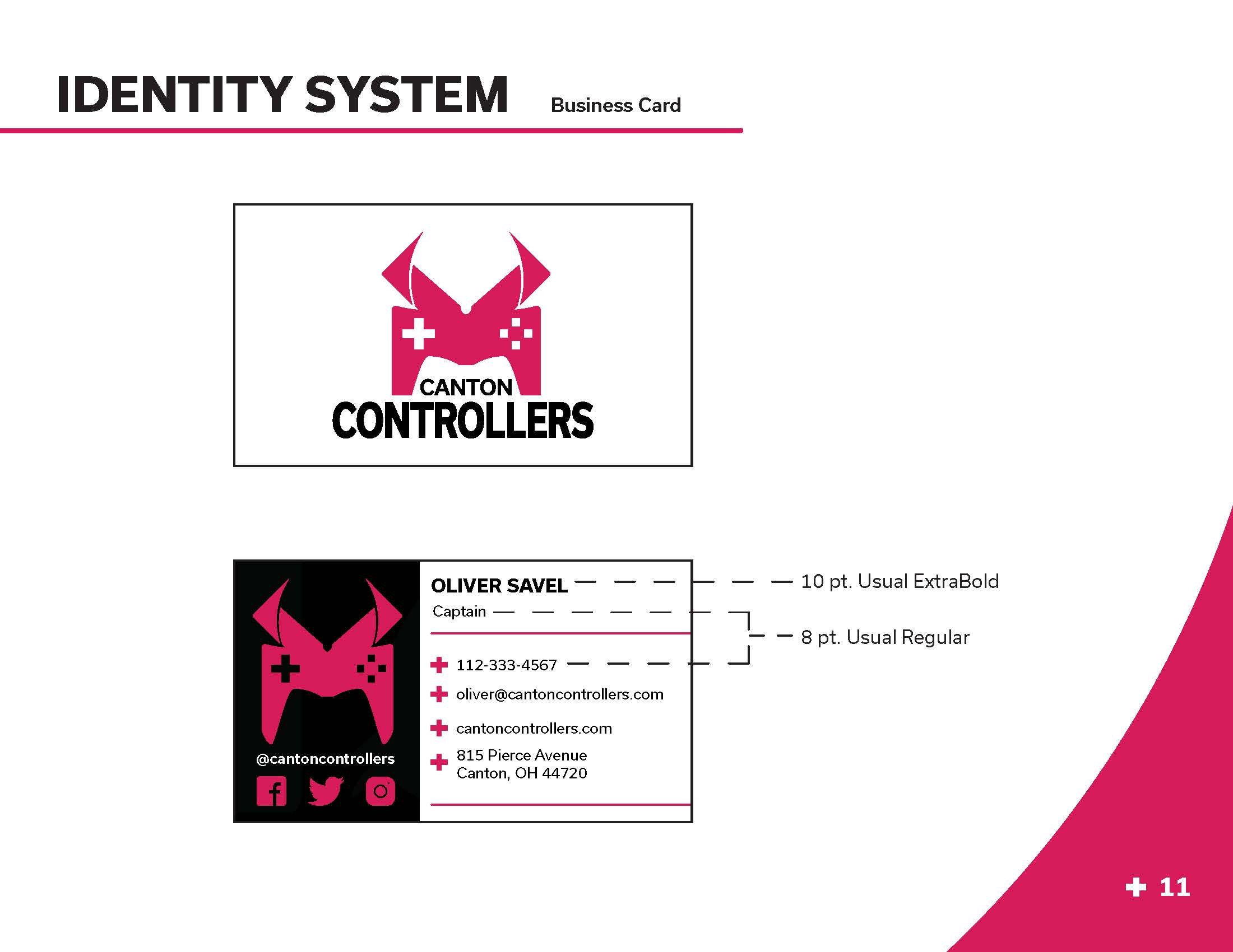
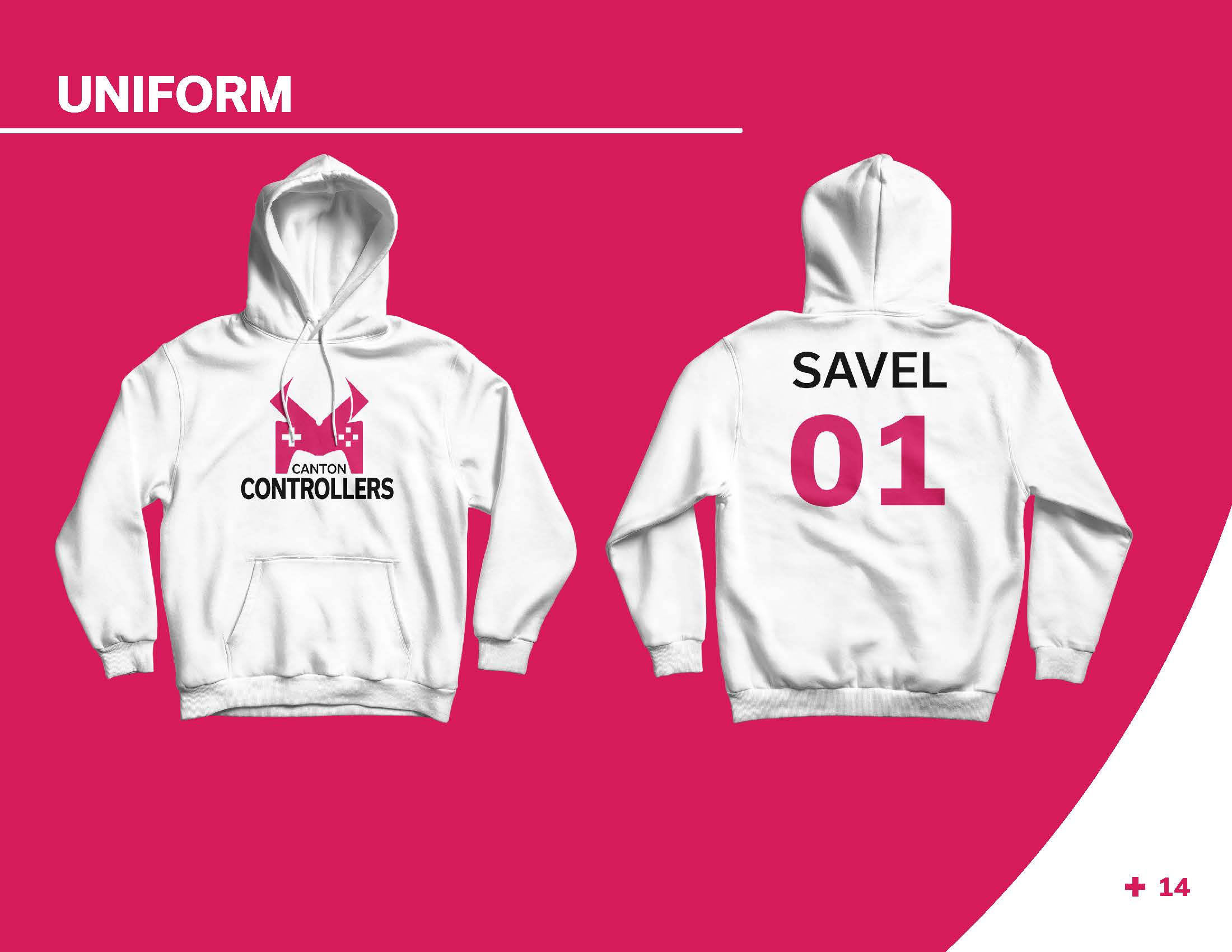
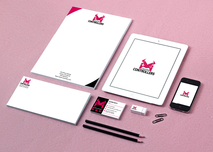
The Canton Controllers branding is bold. A strong, sans serif font called Usual helps to convey this. The hot pink swatch not only contrasts with the black and white swatches, but it is not a typical color seen in the esports scene, making the logo stand out. The logo uses the imagery of a controller, which is a play on the team’s name. The sharp horns on the controller create a sideways C and symbolize the team’s strength and virtue.
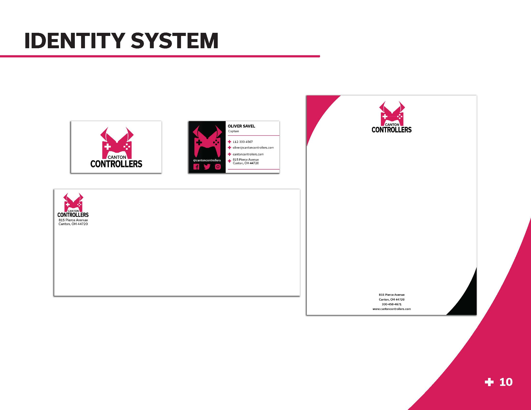
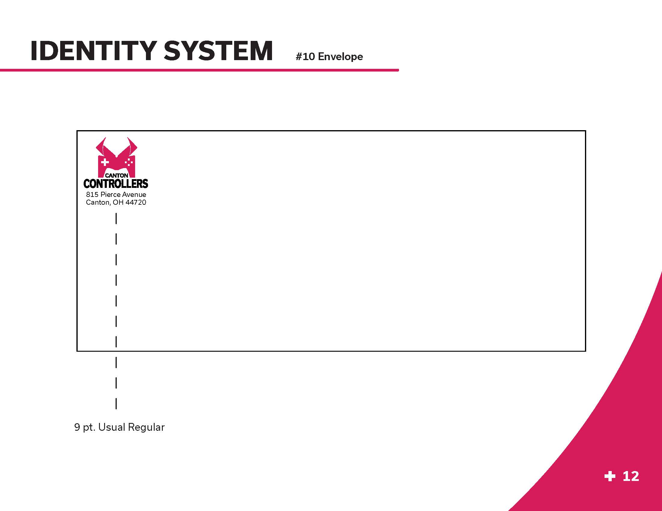
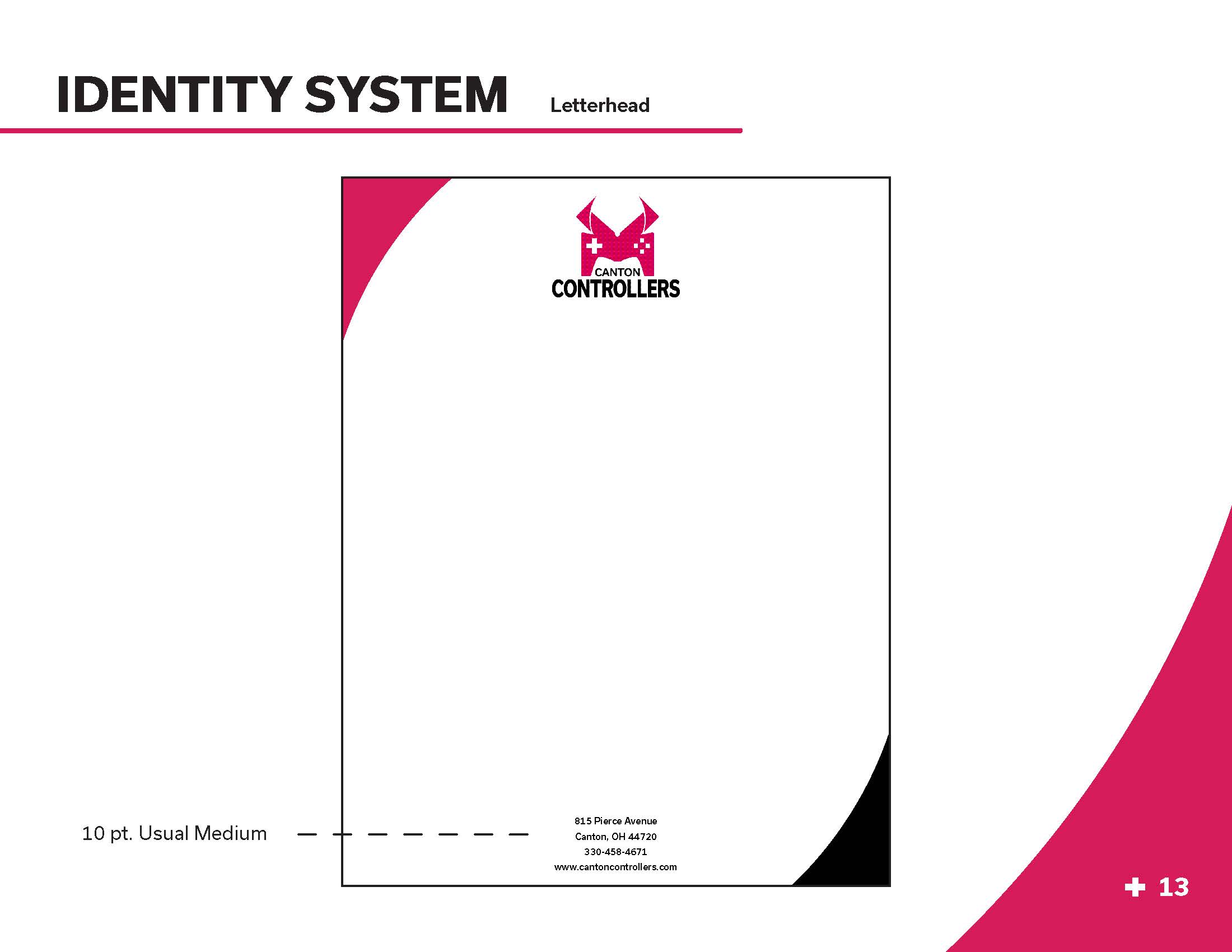
The Canton Controllers’ branding system includes a letterhead, business card, and a #10 envelope. All items feature the logo and pull in different elements. For example, the angle from the horns is used to create a border on the letterhead.
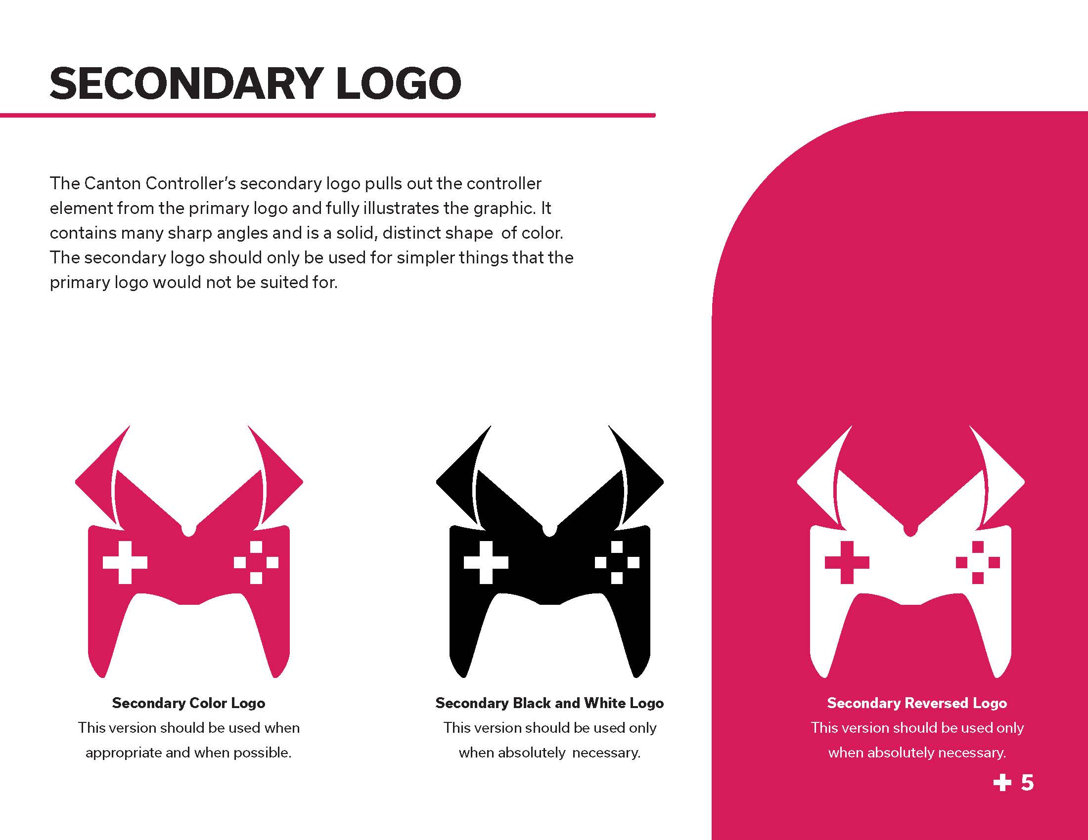
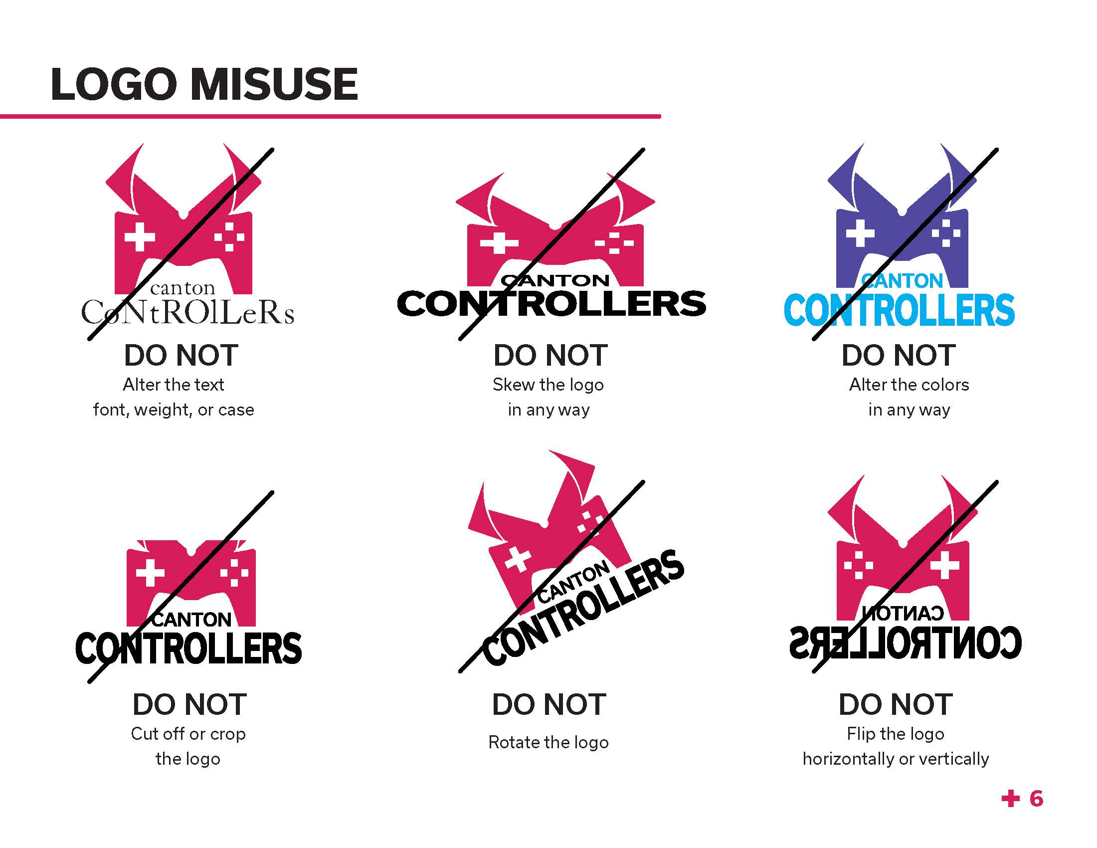
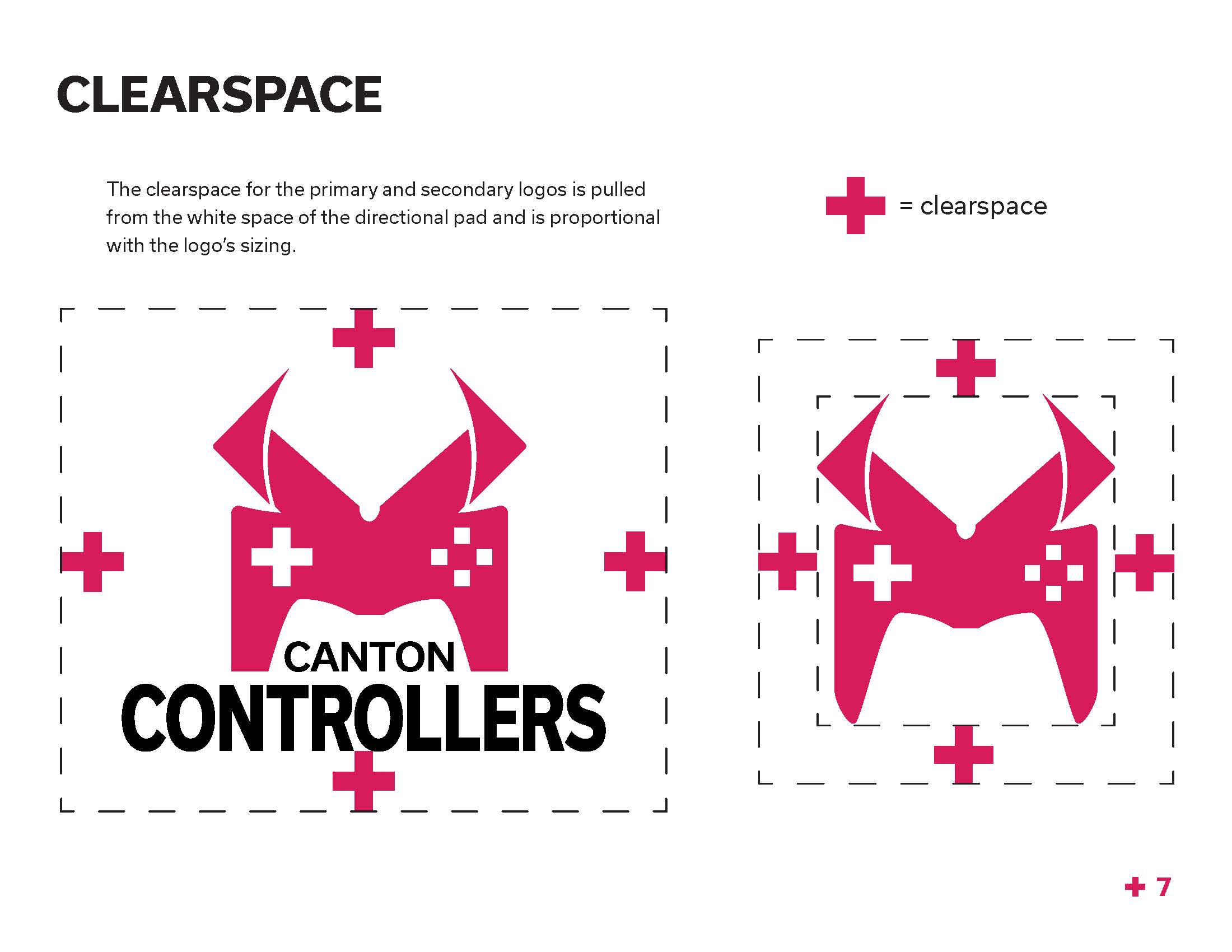
The identity guide for Canton Controllers provides a convenient place to view the primary and secondary logos, the proper use, branding system, and more.