R!ch Cihlar Gallery and Shop
Spring 2023
I worked with R!ch Cihlar to design him a website that represented him as an artist and gave him a place to sell his work.
R!ch has a particular style and I wanted to incorporate it throughout the site. Black and white are strong base colors while blues serve as accent colors. The site also relys on R!ch's artwork to provide backgrounds and textures for some of the site pages. This helps to bring the most authentic version of R!ch's style because they are actual examples of his art.
R!ch often uses stenciling in his art and it is reminiscent of graffiti. Finger Paint is the main font used for links and titles because it looks like paint strokes and has personality. To pair with it is a contrasting sans serif font that is smooth
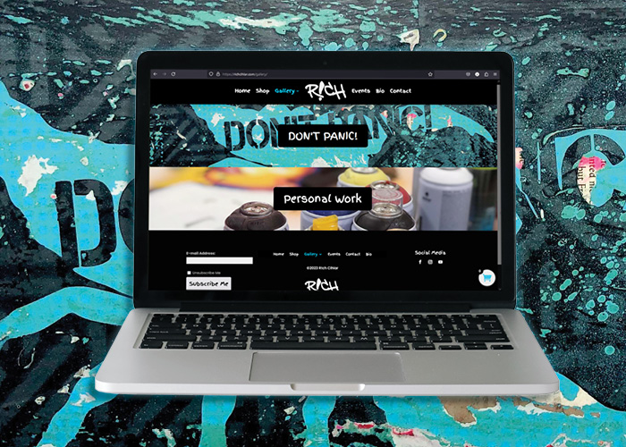
The site has several different sections that a user can navigate to. The home page includes blog posts written by R!ch as well as important links in the carousel. The next navigation destination is the shop. It has options in which a user can filter his work by category, price, or keyword. Next, there is a gallery drop down that is separated into his personal work and collaboration unit called DON'T PANIC!. An events tab that lists details about shows R!ch is involved in. Then, there is a bio tab that gives background on R!ch. Finally, there is a contact navigation link where a user can submit a message to R!ch as long as they correctly complete the captcha.