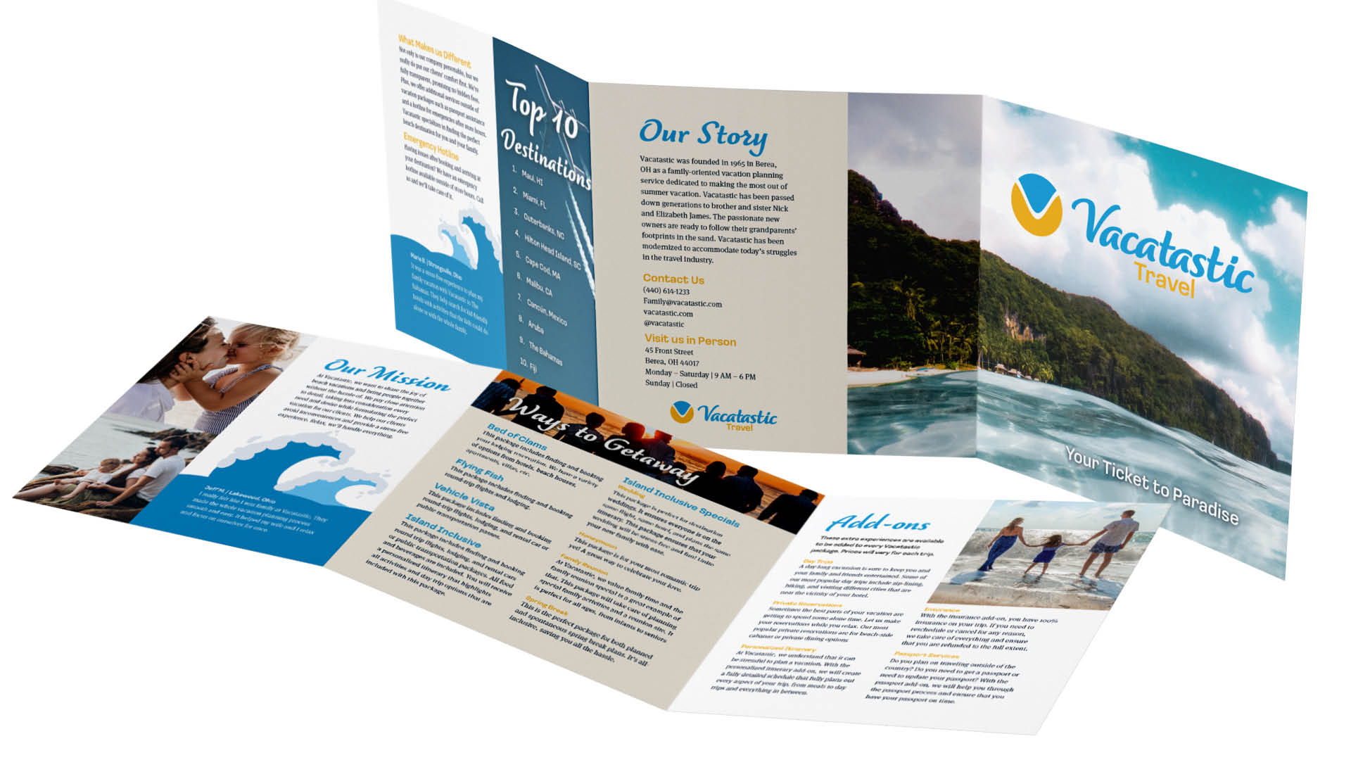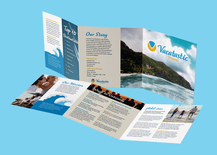
Vacatastic Brochure
Fall 2021
Vacatastic is a conceptual travel agency that appeals mainly to clients that want to go somewhere with their family. Vacastic offers different packages and services to make the vacation planning process as simple and efficient as possible with the best results.
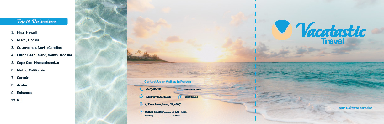
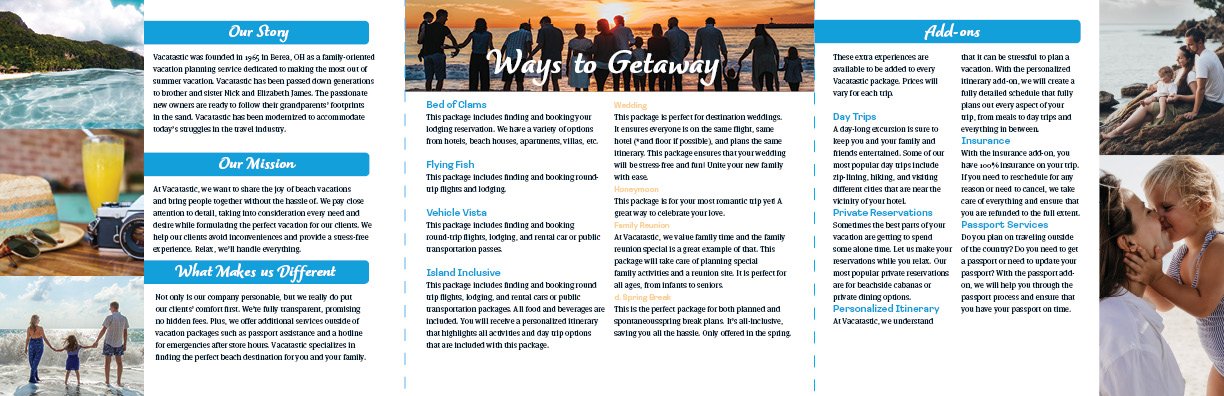
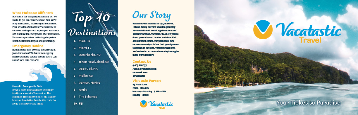
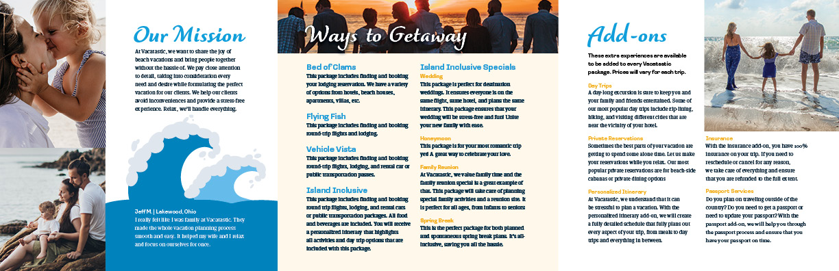
The Vacastic brochure neatly compiles useful information for potential clients into a longform document that they can fit in their pocket. The information within the brochure includes the story of the company, testimonials, packages, and services offered.
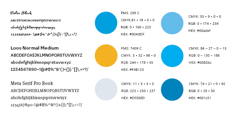
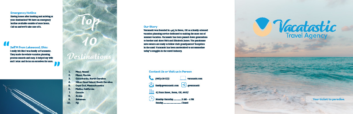
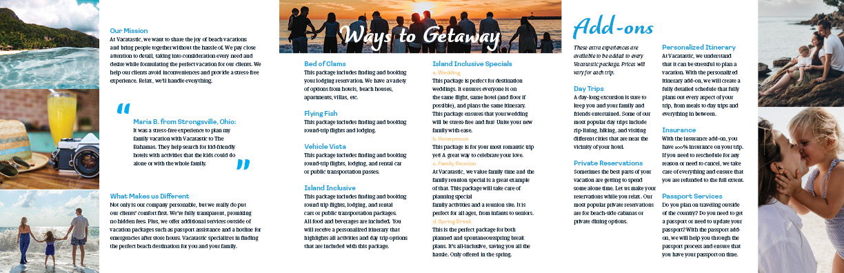
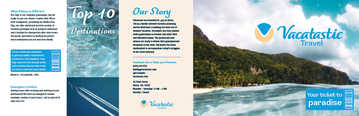
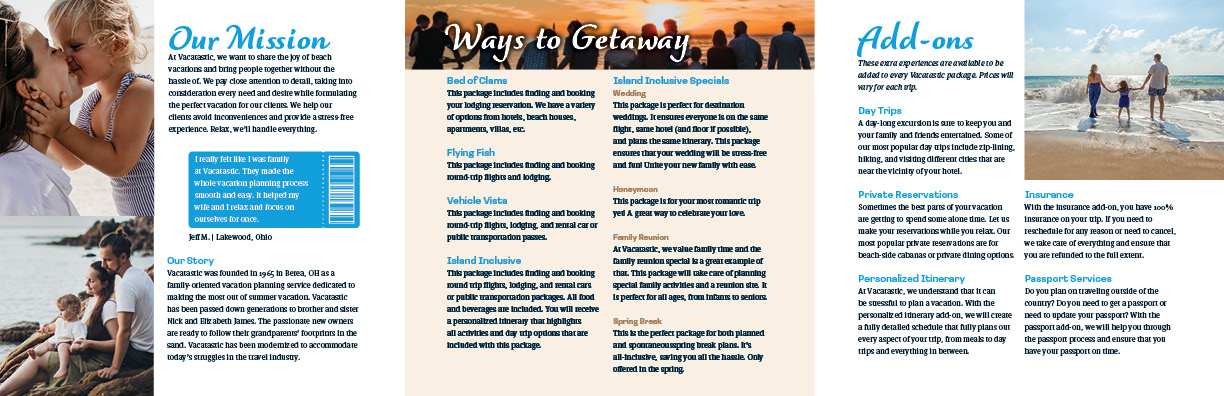
Research suggests that tropical beaches are the most desired travel location, and Vacatastic caters to that fact. Blues and yellows are the most abundant colors. They are applicable to the overarching aesthetic of Vacatastic. Additionally, many of the photos chosen for the brochure show families enjoying the beach which inspired clients to seek out a similar experience. The handwritten-like heading font and sans serif subhead font pulls from the logo. The serif font used for body text successfully contrasts the other fonts. All the elements work together to guide a potential client’s eyes through the brochure and lead them to choose Vacatastic as their travel agency.