Vacatastic Packaging
Fall 2021
Vacatastic is a fictional travel agency that has a warm, welcoming environment driven by a focus on bringing families together. It is very accommodating and offers a variety of vacation packages and services with the goal to make the whole vacation planning process simple and smooth for clients.
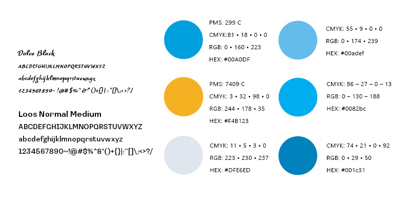
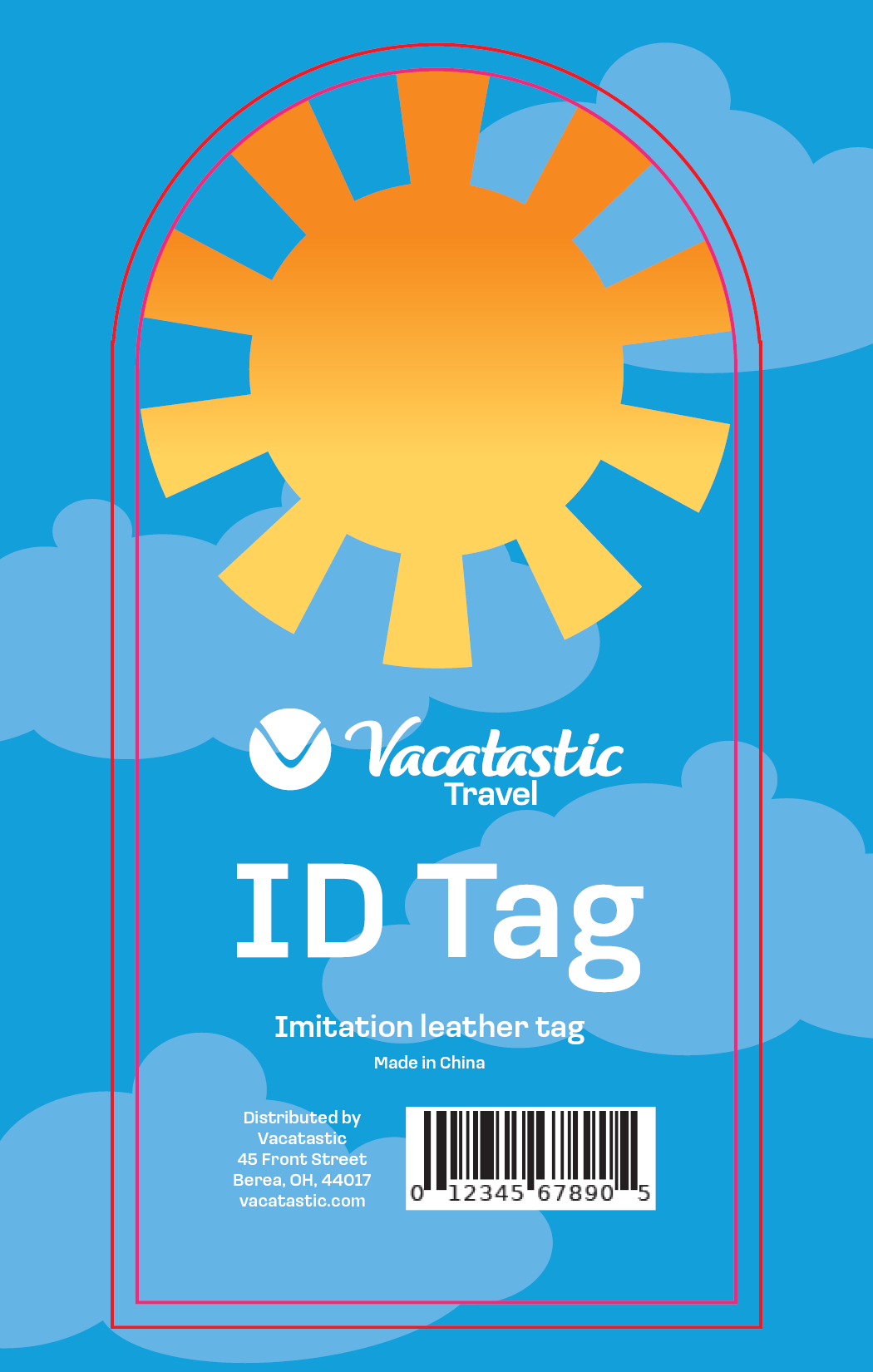
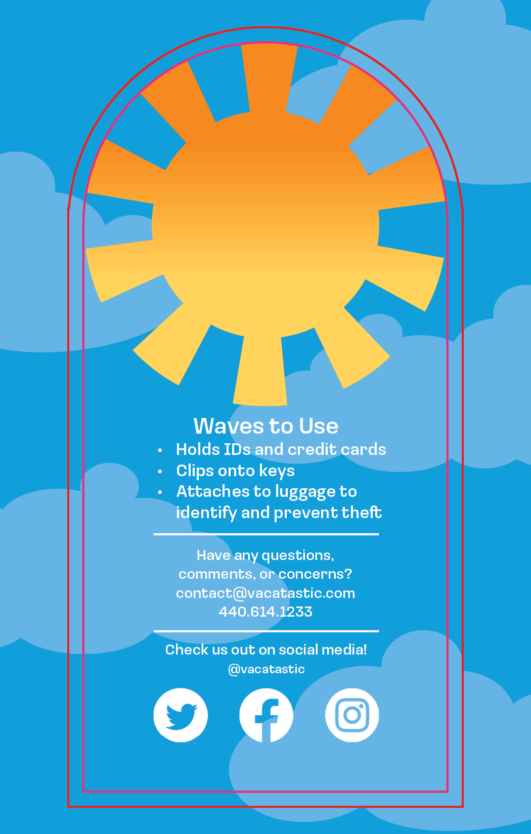
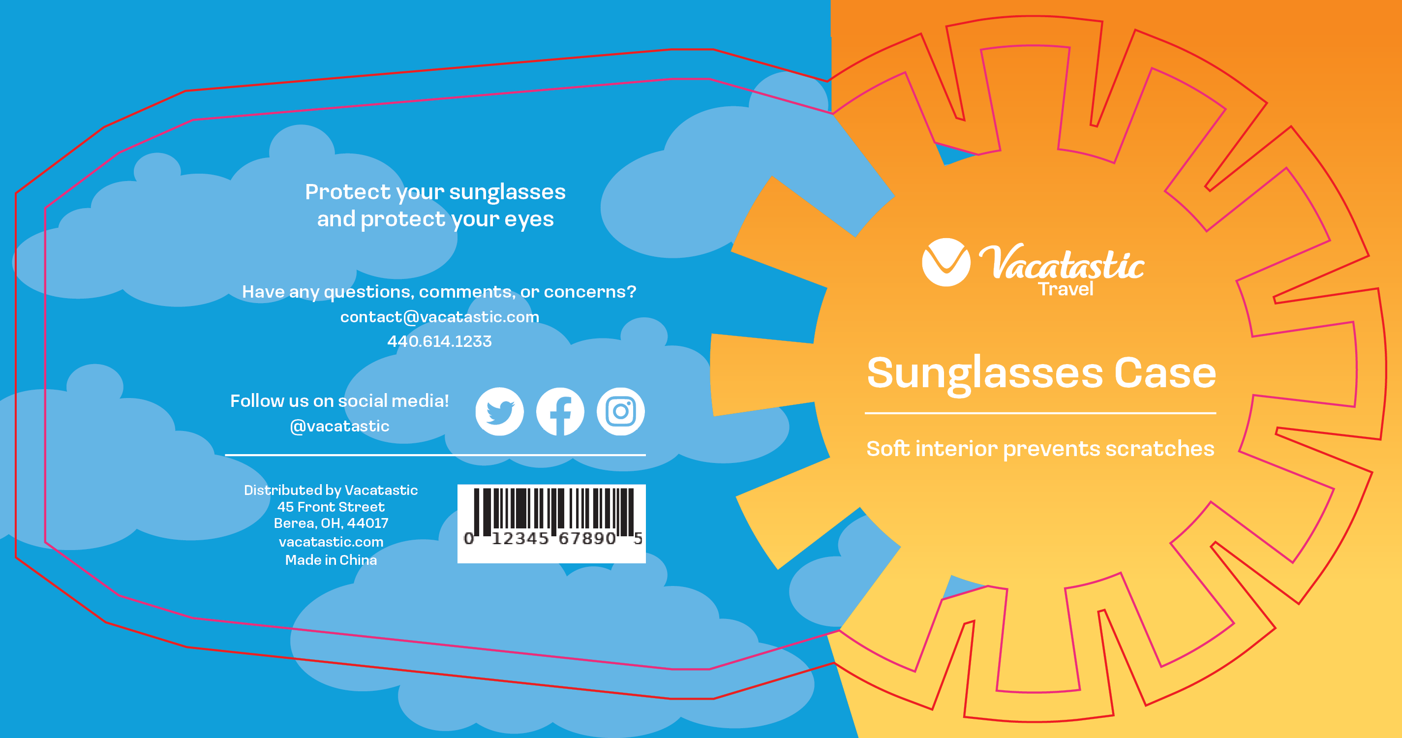
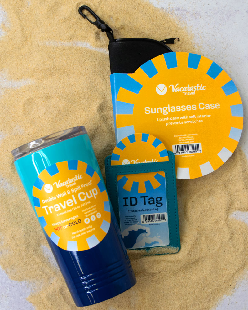
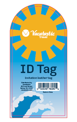
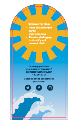
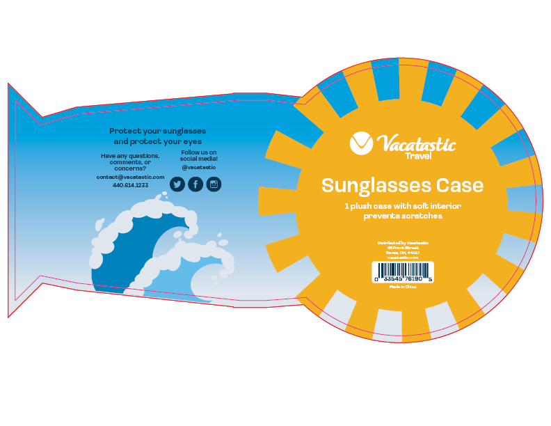
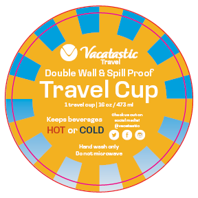
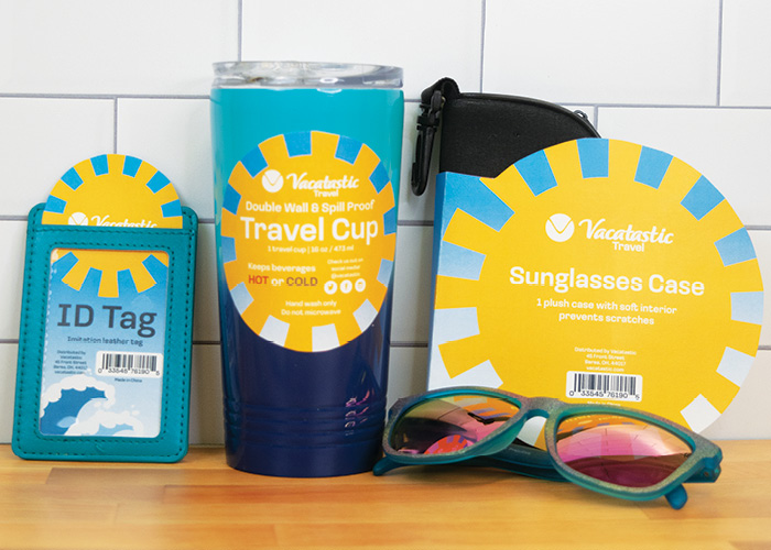
Beach imagery significantly influenced Vacatastic branding. The saturated and serene blue color from the primary color logo that is used is inspired by both the sky and the ocean, for example. A bright yellow also taken from the primary color logo helps to create a sun graphic found on each packaging. It draws in the viewer’s eye by standing out against the blue, which gradually shifts into wave graphics on some of the items.
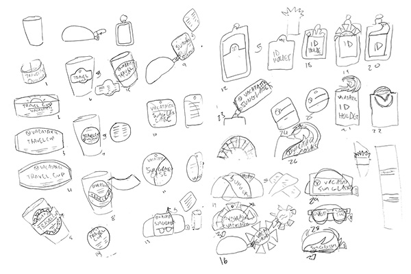
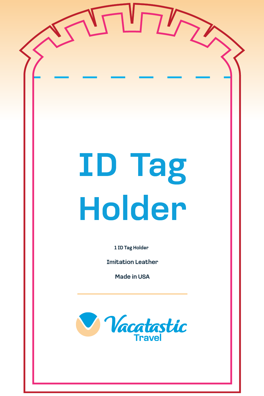
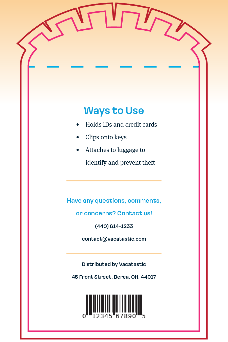
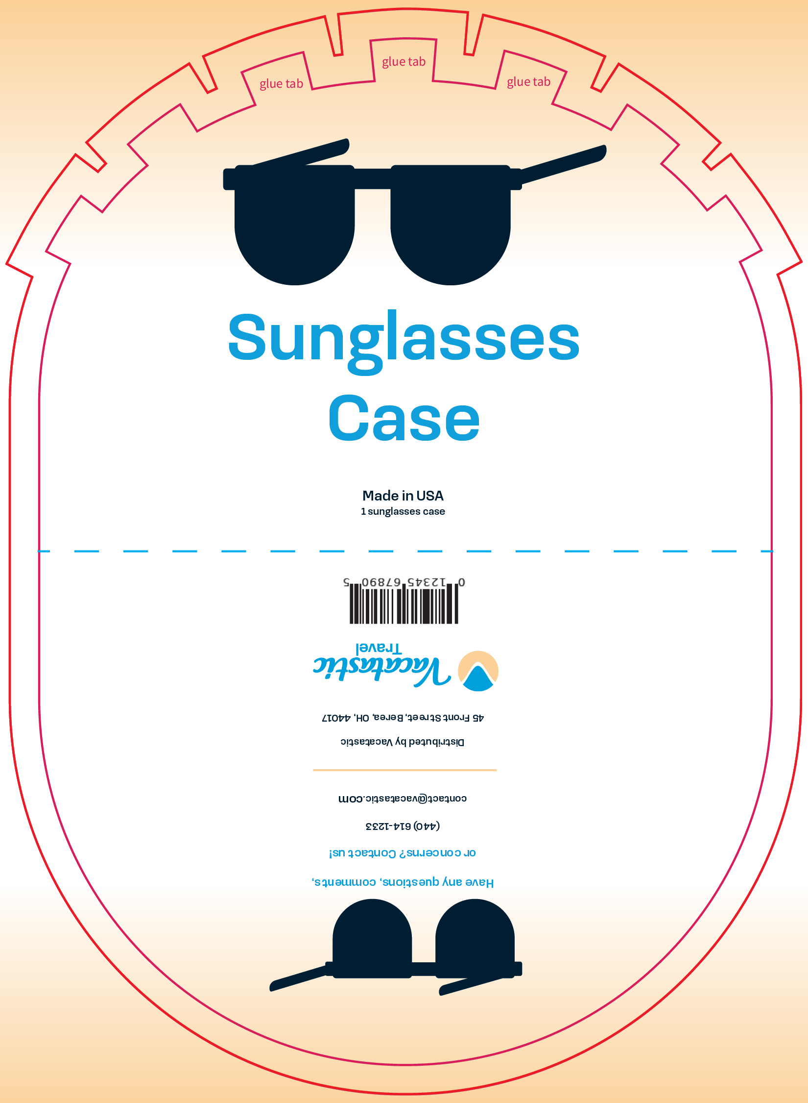
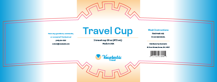
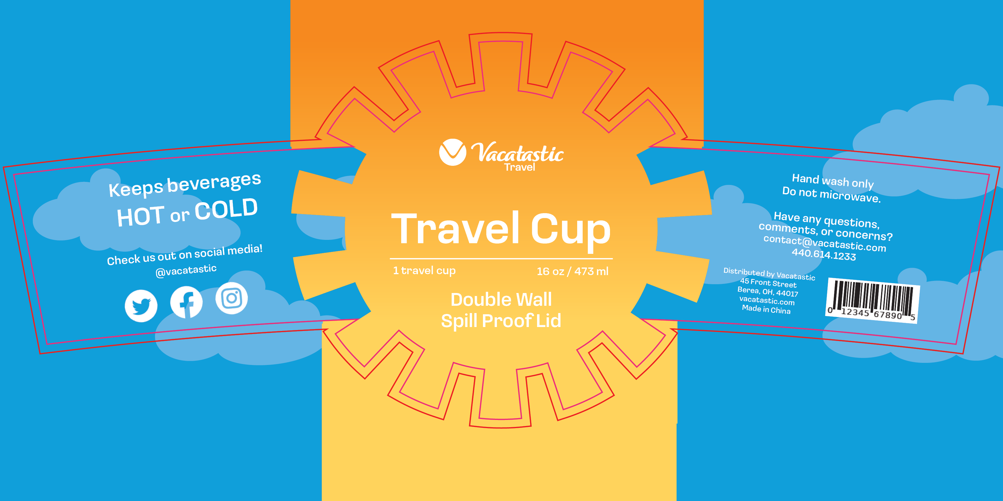
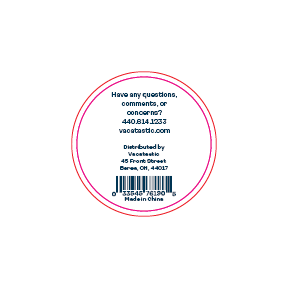
The packaging was created with simplicity in mind. That includes the idea that the packaging is supposed to be easy to remove. The travel cup stickers are simple circles and peel off with ease. The sunglasses case has the packaging built around it. It is easy to slide the case out of the packaging or simply tear apart the layer. The ID tag has an insert that is also easy to remove. These designs provide the most direct path for clients to begin using their items as soon as possible. Vacatastic’s intent to make all aspects of vacationing tranquil clearly translates into the packaging.
